Compress Images Without Losing Quality: JPG 100 vs 80 Explained
Is JPG 100 vs 80 visibly different? Almost never — Q80 is 3-5x smaller with no perceptible loss. What the quality slider really does, and the safe sweet spot.
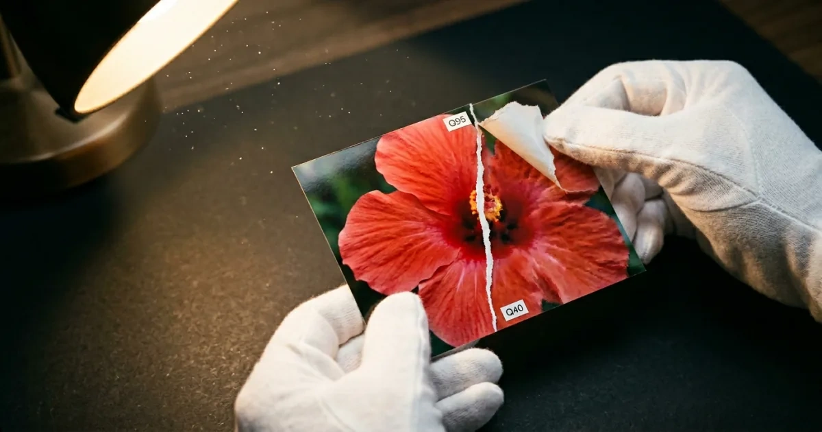
You drag a 4 MB JPG into a compressor. You see a “Quality” slider from 0 to 100. You drag it to 95 because you don’t want to lose anything.
That is the exact mistake almost everyone makes. The slider is not a percentage of your image. Quality 80 is not “throw away 20% of the image.” For most photographs, the difference between Quality 80 and Quality 95 is invisible to the human eye while the file is three to five times smaller.
This is what the slider actually does, and where the real sweet spot lives.
”Quality 80” is not a percentage of anything
The JPEG quality scale is arbitrary. Different programs use different internal mappings. Photoshop’s Q12 and GIMP’s Q95 are not directly comparable; neither is Adobe Lightroom’s Q80 versus the JPEG library’s Q80.
What the slider really controls is the quantization table — how aggressively the encoder rounds off the high-frequency components of the image. JPEG splits an image into 8×8 pixel blocks, runs a discrete cosine transform on each one, and then divides the result by a quantization matrix. Higher quality means smaller divisors, which means more high-frequency detail survives.
Lowering the quality from 95 to 80 doesn’t remove detail uniformly. It mostly throws away high-frequency information your eye barely notices — subtle texture variation, fine noise, micro-gradients in skin tones.
The places JPEG starts to look bad are predictable: text edges, sharp logos, and pure color gradients (sky, skin, fog). Those are the regions where the eye does notice when the encoder cuts corners.
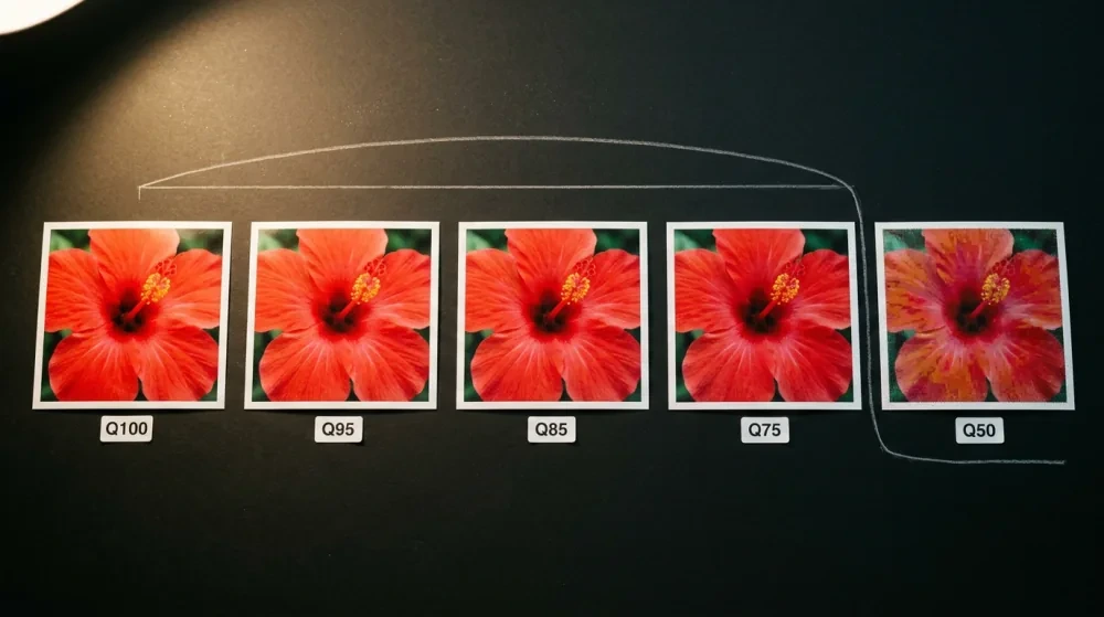
The actual sweet spot, by the numbers
The numbers below come from a direct file-size benchmark on a 1233×1233 photo using libjpeg’s IJG quality scale. Different images compress differently — high-detail photographs spread out more across the low-Q range than smooth scenes do — but the shape of the curve (each step down saves less and less) holds across content:
| Quality | Visual difference vs. PNG original | File size vs. Q100 | Use case |
|---|---|---|---|
| Q100 | Imperceptible | 100% (baseline) | “A mathematical limit, not a useful setting” — IJG FAQ |
| Q95 | Imperceptible | ~45% | Pro photography, e-commerce hero shots |
| Q90 | Imperceptible at normal viewing | ~30% | High-quality web, blogs |
| Q85 | Barely noticeable at 200% zoom | ~24% | Web sweet spot — blog covers, galleries |
| Q80 | Noticeable only when zoomed in | ~20% | General web, social media |
| Q75 | Visible softening on close inspection | ~16% | IJG default; thumbnails, previews |
| Q70 | Edge ringing on logos and text starts to show | ~14% | Below this is the quality cliff |
| Q50 | Obvious blocking and color banding | ~12% | Don’t, unless file size is critical |
Two practical rules fall out of this:
-
Q100 is a trap. Going from Q95 to Q100 produces a file two to three times larger with zero visible improvement. The IJG (Independent JPEG Group) FAQ — the reference document for the libjpeg encoder — describes Q100 verbatim as “a mathematical limit rather than a useful setting” and adds: “If you see a file made with Q 100, it’s a pretty sure sign that the maker didn’t know what he/she was doing.”
-
Below Q75 is where the eye actually catches the encoder. Each step down saves smaller and smaller amounts of file size while introducing more obvious artifacts. The “quality cliff” sits around Q70–75, not Q85. Notice the gap between Q70 (~14%) and Q50 (~12%) above — dropping the slider from 70 to 50 saves almost nothing, but the visible damage is dramatic.
The actionable target for most web work: Q80 to Q90. Below that you’re saving pennies and risking visible damage; above that you’re paying double for invisible refinement.
Where the savings come from (and where they don’t)
JPEG compression is designed around the limitations of human vision. The encoder discards information your eyes are bad at seeing — high-frequency detail, subtle color shifts in saturated regions, fine noise that looks like grain.
This works extremely well on:
- Photographs with natural texture and noise — the encoder hides its work in the existing chaos
- Soft scenes — landscapes, portraits with skin tones, subdued light
It works poorly on:
- Text and logos — the eye is calibrated to see edges; even mild artifacts look ugly
- Sharp graphics with flat color regions — UI mockups, cartoon illustrations, charts
- Smooth gradients in a single hue — blue skies, fog, gradient backgrounds. Look closely and you’ll often see “banding” — discrete steps where the encoder ran out of budget for in-between colors.
If your image is a screenshot, a chart, or a logo, JPEG at any quality setting will look worse than a properly compressed PNG. Use the right format first; tune quality second.
A quality cheat sheet by use case
| Use case | Recommended JPEG quality | Why |
|---|---|---|
| Print or photo book | Q92–Q95 | Print catches subtle artifacts that screens hide |
| E-commerce product photo | Q85–Q90 | Detail influences purchase; page weight still matters |
| Blog post cover or article image | Q80–Q85 | Web sweet spot; readers are reading text |
| Social media upload | Q75–Q80 | Platforms re-encode anyway; uploading at Q95 is wasted bandwidth |
| Image thumbnail | Q70–Q75 | Small displayed size hides artifacts |
| Email attachment | Q80–Q85 | Balances quality with mailbox limits |
| Photography portfolio | Q90–Q95 | Pixel-peepers are your audience |
PicShift defaults to Q85 in its converters because that’s the value that lands well across most of these scenarios without making people think about it.
When you should not compress
Compressing an already-compressed JPG is a tax. JPEG is generational: every save introduces small new artifacts that the next save can’t undo. If you save a JPG at Q90, then re-open and save at Q90 again, the second one is not the same as the first — it has an additional rounding pass on top of an already-rounded image.
After three to five rounds you start to see “ghosts” along high-contrast edges. Photographers call it generation loss; the image gets a slightly mushy look.
Three rules that follow:
- Keep your master file as PNG, TIFF, or RAW. Export to JPG only at publish time.
- If you must edit a JPG, save the working file as PNG and re-export.
- Avoid round-tripping JPG → PNG → JPG to “preserve” quality. The PNG step preserves what the first JPG already discarded; it cannot recover it.
For the underlying mechanics, why output size can increase explains how PicShift detects when a re-encode would only make a file bigger than the input — and stops.
Lossless options that actually exist
“Lossless compression” is not a marketing word. There are real techniques that shrink files without touching pixels:
- MozJPEG re-encodes existing JPGs with smarter quantization (trellis quantization plus optimized progressive Huffman tables). libjpeg-turbo’s own benchmark reports an average ~8% reduction over standard libjpeg-turbo at the same quality setting; real-world tests on web JPEGs see a ~10% median (range roughly 1–30% depending on the image), at the cost of substantially slower encoding. Strictly speaking, trellis quantization is a lossy refinement — pixels can shift by one or two values — but it’s visually identical at typical settings.
- OxiPNG / Zopflipng re-encode PNG files using better compression strategies (smarter filtering choices, brute-forced zlib output). 10–30% reduction is typical, and the pixels are bit-identical.
- WebP lossless beats PNG lossless on most images. Google’s official benchmark puts the average at ~26% smaller, same pixels.
- AVIF lossless is similar territory but much slower to encode.
These aren’t “magic.” They’re just better encoders than the defaults from 1992 or 1996. PicShift’s image compressor runs the modern encoders by default — for PNG inputs, the savings are mostly metadata and entropy coding gains, with the pixels themselves unchanged.
How to actually find the right quality for your image
Trust the slider only after you’ve checked. The “right” quality depends on the content:
- Pick a representative image — ideally one with text, gradients, and detailed regions
- Export it at Q95, Q85, Q75
- View all three at 100% zoom on your actual display
- Find the lowest setting where you can’t see a difference
Whatever number that is, use it. It’s almost always in the Q80–Q90 range; for highly-textured photographs it can drop into the high 70s with no visible cost.
For batch work, this isn’t worth doing image-by-image. Pick a single quality target for the batch — Q85 is the conventional default for a reason — and ship.
Compress in your browser
PicShift’s image compressor runs locally — files never leave your device. It uses MozJPEG, OxiPNG, and modern WebP / AVIF encoders, picks sensible defaults (Q85 for JPG/WebP, lossless metadata stripping for PNG), and shows you the size savings before you download.
For format-specific conversion with the same compression machinery:
- Convert PNG to JPG — drops file size for photographs that don’t need transparency
- Convert JPG to WebP — typical 25–35% additional reduction over JPG at matched quality
The setting that actually matters
Don’t max out the quality slider out of fear. Q95 is overkill for the web; Q100 is overkill everywhere. Q80 to Q85 is where most people should be living for web images, with the slider going up to Q90–Q95 only for print and pro photography.
The savings come from JPEG being honest about what your eye can’t see. The mistake is using JPEG for things your eye can see — text, logos, sharp gradients. For those, use PNG or WebP lossless instead.
If you want the longer technical version of how compression interacts with file size, image quality vs file size covers what really changes between quality 70 and 95 on the encoder side.